

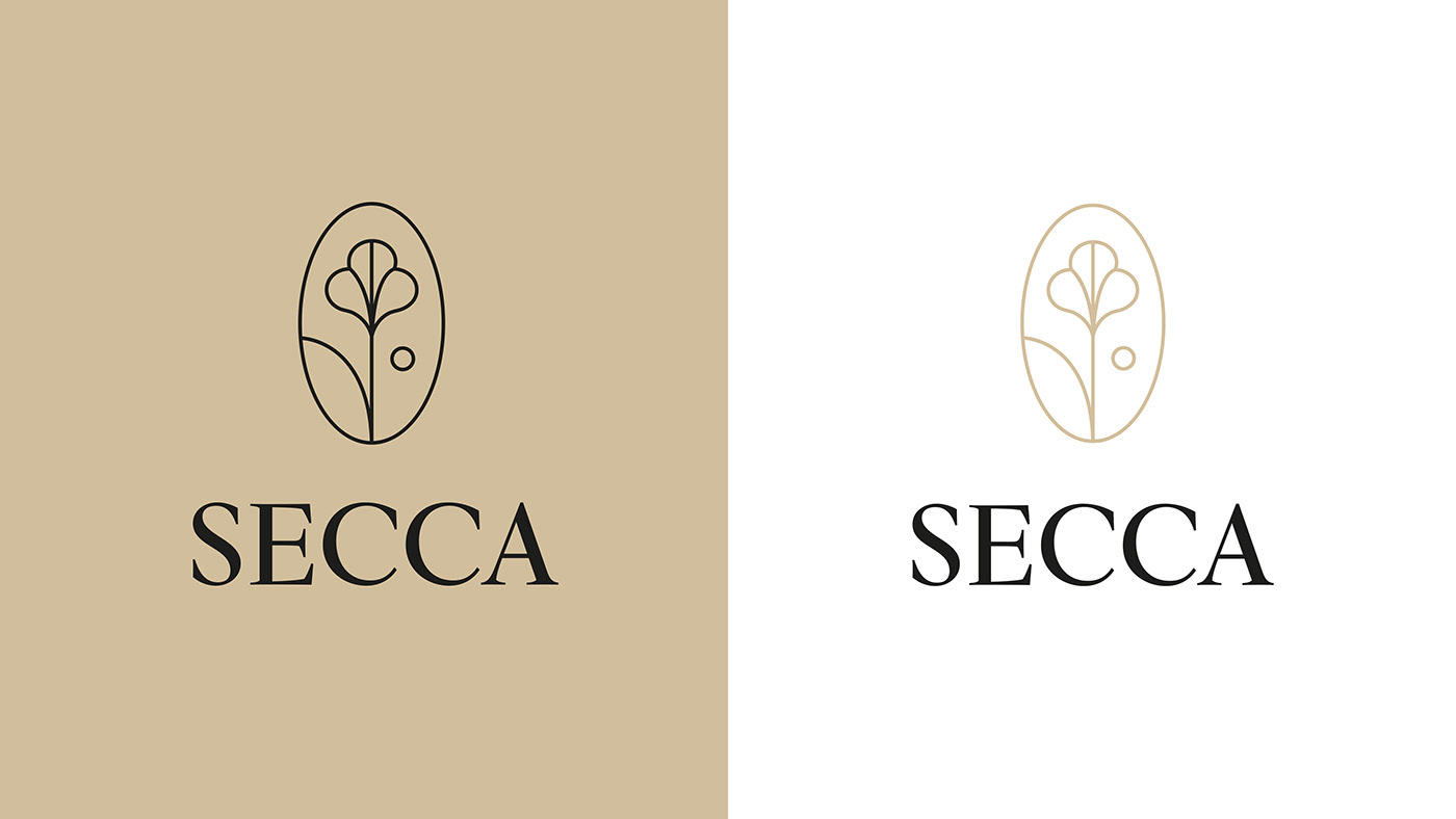
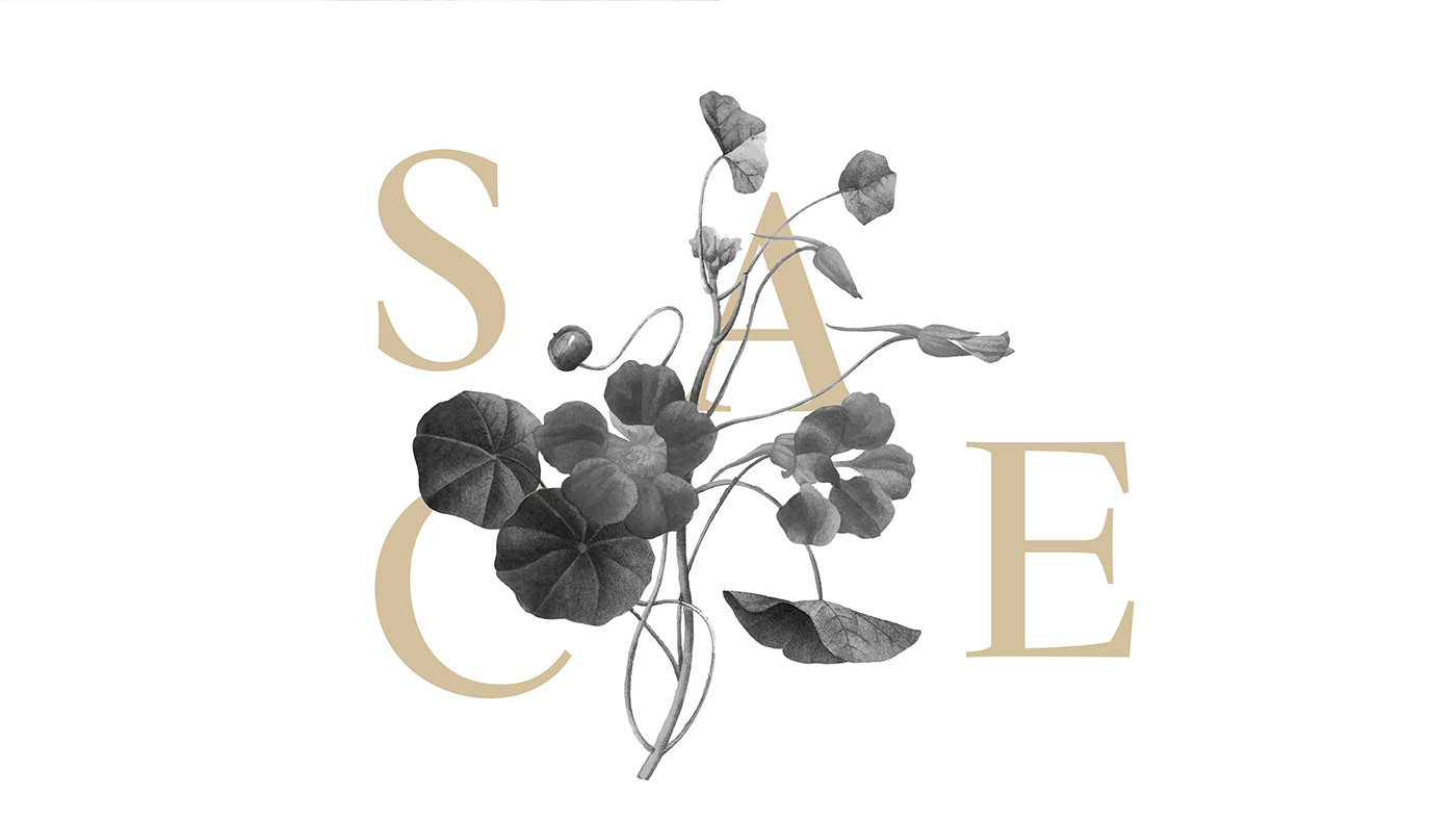
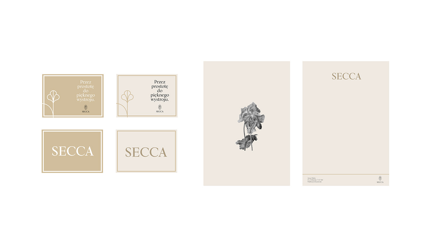
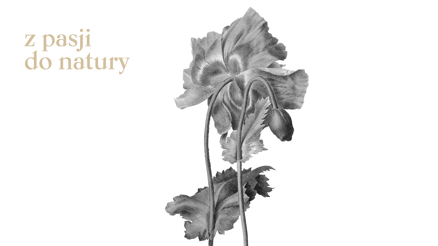
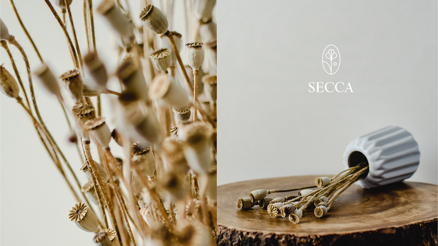
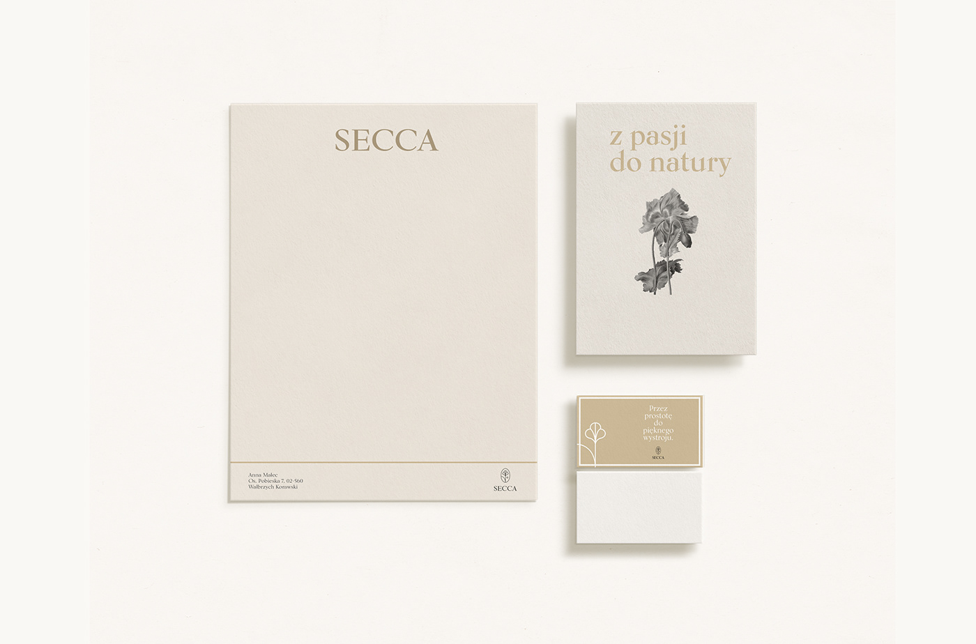
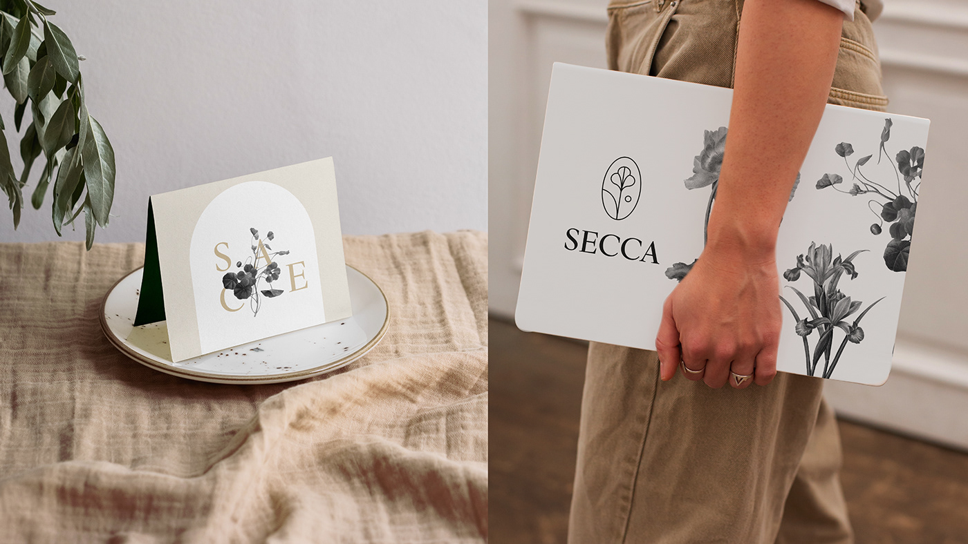
The identification design for the brand that sells dried flowers was developed through simple, sophisticated and retro elements combined with modernity. The cotton flower, the most important flower for the brand, was presented in the logo ring. Typography is very retro, delicate, fleeting which refers to the characteristics and personality of this brand. For the remaining elements of identification, black and white illustrations of flowers were used, which complement the whole brand.
Dried flowers are half alive, half dead. It can be said that they combine the dualism of beings. This idea was transferred to beige color combined with black and white flowers in the illustration.


https://secca.com.pl
https://www.instagram.com/secca_driedflowers/


